In a previous post I spoke about two major approaches to modeling epidemics: the mathematical model and the agent based model. Here I detail the development of a mathematical model using two languages: R and Python. I hope to use these model in order to provide a point of comparison for the dynamics of the ABM model which I will be building.
First Steps
I did a lot of reading and research before getting started on this project. Though I had a conception of how to approach the problem of designing a simulation, I had little practical experience or insight. I began by implementing a standard SIR model in R quite a while back. I have upgraded this model and written a similar mode in Python.
In both my mathematical and ABM models, I utilize a SIRD (Susceptible; Infected; Recovered; Dead) compartmentalized type model, which is a simple representation of disease progression with discrete states. When approaching modeling mathematically, we utilize a set of equations to describe bulk population dynamics:


where β = infection rate; γ = recovery rate; and μ = death rate.
Model Output – ggplot
Both of the programs which I have developed in order to recreate mathematical models are rather similar, and produce seemingly identical results when given the same starting parameters. In both cases I utilized ggplot to produce static charts. Here’s the cleaned up plot that I produced in R. I’ve included the code used to produce this output below. I hope to develop an interactive version of this simulation at some point in the future.
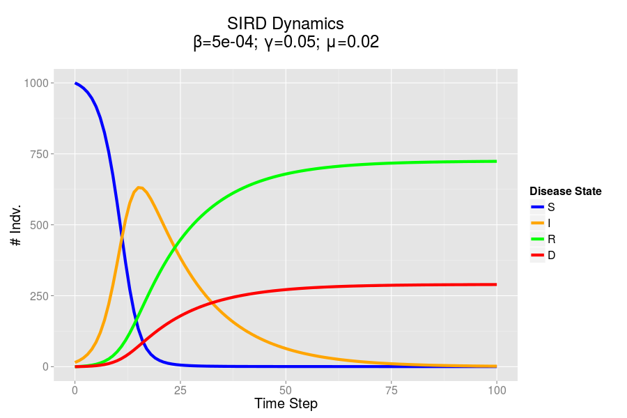
The SIRD dynamics of a model outbreak. In this case, I was attempting to model the outbreak of a fairly virulent pathogen (like a novel influenza epidemic). We can see that the outbreak peaks and resolves fairly quickly, albeit with a rather high mortality rate.
R Code – Updated 12/30/15
require(reshape2)
require(ggplot2)
#SIRD Model of Disease Transmission
S=1000
I=15
R=0
D=0
beta=.0005
gamma=.05
mu=.02
nreps=100
#Create History Dataframe
history = data.frame(time=0, S=S,I=I,R=R,D=D);
#Loop over step function
for(time in 1:nreps){
  newInf = pmin(S, floor(beta*I*S))
  newRec = pmin(I, floor(gamma*I))
  S = S - newInf
  I = I + newInf - newRec
  R = R + newRec
  newDead = pmin(I, floor(mu*I))
  I = I- newDead
  D = D + newDead
  history = rbind(history, data.frame(time, S, I, R, D))
}
#And finally plot
plotdat = melt(history, id.vars = c("time"))
ggplot(data=plotdat)+
  aes(x=time, y=value, color=variable)+
  geom_line(size=2)+
  theme_set(theme_gray(base_size = 15))+
  xlab("Time Step")+ylab("# Indv.")+
  ggtitle(paste("SIRD Epidemic Dynamics\nβ=",beta,"; γ=",gamma,"; μ=",mu,"\n", sep=""))+
  scale_color_manual(name="Disease State", values=c("blue", "orange", "green", "red"))
Python Code
#Loading Libs
import matplotlib.pyplot as plt
import pandas as pd
from math import floor
from ggplot import *
#Initializing Vars
S = 1000
I = 15
R = 0
D = 0
steps = 50
#Disease Parameters
beta = .0005
gamma = .05
mu = .02
history = pd.DataFrame({"S": S, "I": I, "R": R, "D": D}, index=[0])
#Run sim loop
history["step"] = history.index
plotData = pd.melt(history, id_vars=["step"])
ggplot(plotData, aes(x="step", y="value", color="variable"))+geom_line()
for step in range(1, steps):
    newInf = floor(min(max(beta*I*S, 0), S))
    newRec = floor(min(max(gamma*I, 0), I))
    newDead = floor(min(max(mu*I, 0), I-newRec))
    S = S - newInf
    I = I + newInf - newRec - newDead
    R = R + newRec
    D = D + newDead
    history = history.append(pd.DataFrame({"S": S, "I": I, "R": R, "D": D}, index=[step]))
history["step"] = history.index
#Plot using Python port of ggplot
plotData = pd.melt(history, id_vars=["step"], value_vars=["S","I","R","D"])
ggplot(plotData, aes(x="step", y="value", color="variable"))+geom_line()+xlab("Time Step")+ylab("# Hosts")