Modeling Epidemics – First Steps with Agent-Based Modeling Pt. 2

We spent the last post discussing principles of agent based modeling, and the basic layout of the model I have initially created. Now it’s time to see some results! All of the code used to generate this model can be found here.

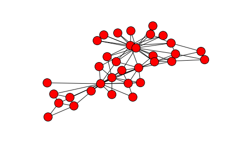
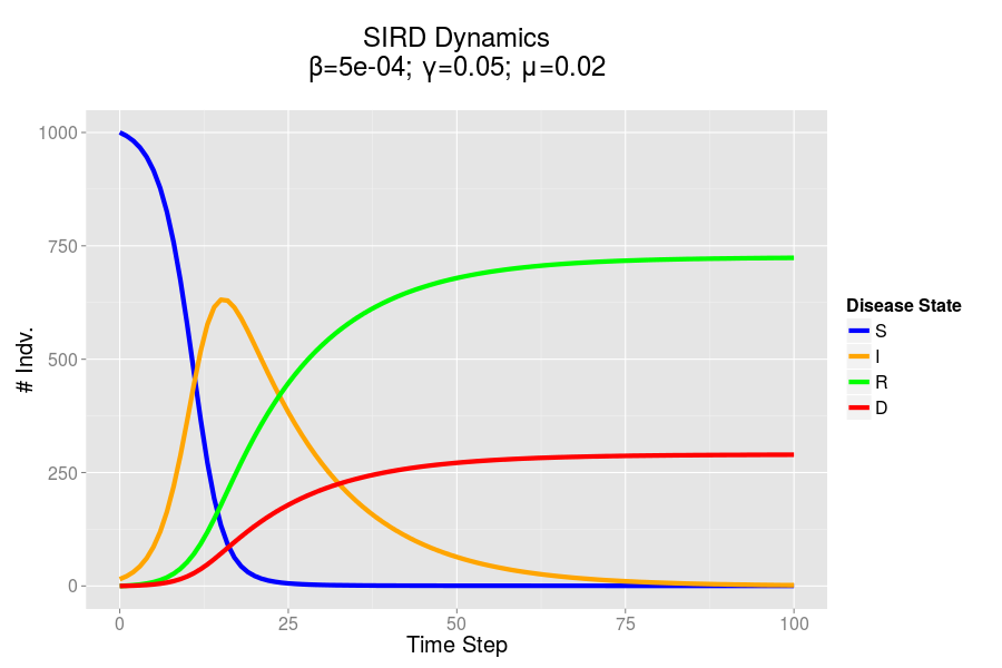
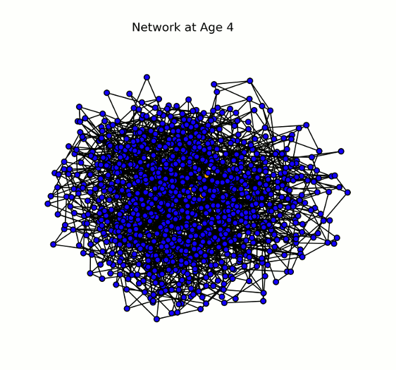
First off, I want to talk a bit about the approaches which I have taken towards the visualization of my model, as well as the inadequacies of these approaches. In the previous post, I discussed the fact that my model is based upon the usage of networks (graphs) for the mapping of social interactions. My first approach to visualization (particularly during the development process) was plotting these networks, as this allowed me to see how the disease was spreading in my model, and debug. This worked well during the testing phase, when my model population was rather small; however, when I scaled up the model, this technique did not work as well.

Example Small World Graph

Two example small world networks generated and drawn by the networkx library in Python. As the number of nodes increases, ease of interpretation decreases dramatically. The graph on the right is often referred to as a hairball.

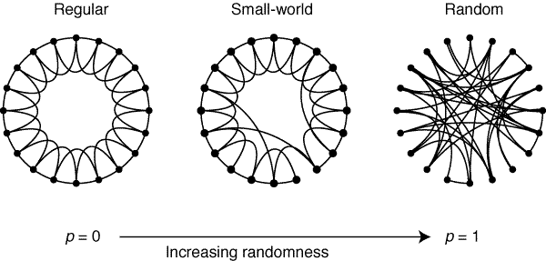
Nonetheless, I have yet to find any better way of displaying the change in the nodes of my network over time. There are other software out there which are better suited to the display of graphs (and allow for greater interactivity), but I have yet to spend much time exploring them. I am particularly interested in two softwares: Gephi, which is a Java based software built for the purpose of both analyzing and visualizing graphs; and sigma.js, a browser-based Javascript library built for the purpose of visualization.

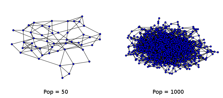
Network Animated GIFs

For now, I have harnessed a technique I have leveraged in a previous project in which I analyzed of US Senate data. I utilize the ImageMagick “convert” command-line tool in order to combine a series of static images into an animated gif (example here). For my network, I animate the nodes as they change color to indicate their infection state. The vizualization is a bit chaotic, but I think it looks real neat.

Animated Network Graph

Animation displaying the spread of the disease through the network (# nodes = 1000). Each node (or individual) can have one of four states for a given pathogen: susceptible (blue), infected (yellow/orange), recovered (green), or dead (red). Here we show a single pathogen system.

Graphing Disease Progression

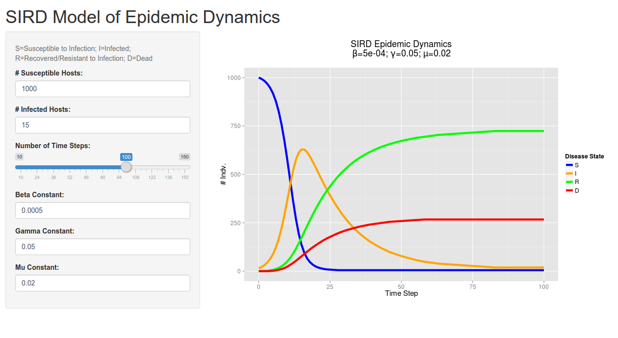
Though the animated network looks pretty cool, it doesn’t tell us much about the quantitative dynamics of the disease. As such, I have the model create a graph of the SIRD dynamics for each pathogen present in the system (so far I’ve only tested single pathogen systems).

Animated Network Graph

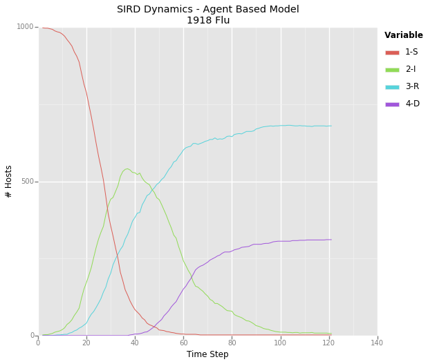
A graph depicting the dynamics for a theoretical pathogen – I’ve taken to calling it the 1918 flu due to it’s rapid spread and high mortality rate. This graph represents the same epidemic displayed in the above animated network.

Expected vs. Actual Results

The fact that my model works at all is already pretty exciting, it was not an easy process to work out all the bugs, but what was more interesting was how closely the model mirrored the dynamics which I derived from my mathematical models. This indicates to me that my agent based model has some degree of predictive validity!

Epidemic Dynamics Comparison

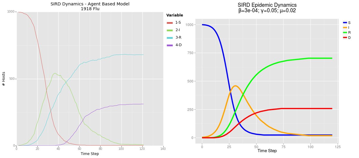
Comparison of results from my agent based model (ABM) on the left and mathematical model on the right. Click to enlarge.

Next Steps

Now that I feel I’ve got a hang of the basics of ABM, I’ve got some real thinking to do. The value of these models is lies in their predictive potential, however I’m not sure exactly which questions I should be asking and trying to predict the answers to. My first impulse has been to explore the internet for epidemic datasets, which I can use as the basis for a predictive model. It’s good to have some sort of empirical data behind any given model, both as a point of comparison, as well as a guide for modeling a real-world system.

I think the biggest thing that my current model lacks is the incorporation of spatial data: clearly the real world is not a flat plane, and there are a number of geographical features which can greatly impact disease transmission. My current thoughts on approaching this issue involve the use of real-world GIS data, as a means of determining population density and movement. In a model of human interactions, it may also be important to incorporate physical objects with which hosts can interact. Inanimate objects (known as fomites) are quite capable of transmitting pathogens, and this sort of interaction may be completely unrelated to social networks.

Ultimately the direction I will take in continuing this research will depend on the questions I am attempting to answer. If you have any ideas of how I can continue this work, feel free to drop them in the comments section. If you’re interested in collaborating with me on this research, please feel free to get in contact. Thanks for reading!

Modeling Epidemics – First Steps with Agent-Based Modeling Pt. 1

For those who have been reading along with my past couple of blog posts, you’ve seen me explore different means of utilizing computational modeling to explore epidemic dynamics. In my last two posts (here and here), I developed a basic set of scripts (in R and Python) which apply a series of simple formulae to model aggregate/bulk infection dynamics in a population. In this case, the model is considered deterministic: meaning that my outcome will be the same every time I run the model.

Now, these mathematical/deterministic models can be useful for approximating the general outcomes of an outbreak, however they can fail to capture the nuances which might be present in a more complicated model. There is less flexibility in this kind of model to alter population or disease behaviours without completely redefining our equations. This is not to say that such models cannot be created, simply that I do not have the expertise or know-how to do so.

Instead, since the beginning of this project, my intention has been to utilize agent based modeling (ABM) as a tool for exploring epidemic dynamics. Just to restate what I discussed in this post, an agent based model does not utilize formulas to model epidemics; instead, the modeler must design agents (objects in an artificial/simulated world), define how these agents interacts, and when they interact. The simulation is then run, and the outcome determined at the end. Typically, these simulations incorporate some degree of randomness, so no two simulations will have exactly the same results (provided the random number generator seed is different).

Jordan’s First ABM

I decided to start simple for my first attempt at designing an ABM, though I did not want the model to be so simple that it would no longer be meaningful. There are three major components to any agent based model, and I will try to describe how I implemented each part in my model. I define each of the components of my model as a Python class for ease of use, and efficiency of code:

  1. Environment: In order for an ABM to exist, there must first be a space in which our agents can exist and interact. In my model, I call this the “World” class, and take this world to be a spatially homogenous region in which social beings can interact. Though the world I use is simplistic (possessing no geographic traits or barriers), it will serve well for this initial model. In future models, I hope to simulate a more realistic world, perhaps using GIS data from a major city (like my current home, Houston), in order to account for spatial factors in disease transmission.
  2. Agents: In this case, there are two major types of agents, hosts and pathogens. I’ve defined my hosts under the “Person” class, though really they are too simplistic to accurately represent people (they just interact with one another, not the environment); instead it may be helpful to think of them more like any other social organism. The pathogens, on the other hand, are defined by the “Disease” class; they are simply capable of infecting hosts, adding an “Infection” class to be stored in for a given host (this class contains the logic for recovery and death of the host).
  3. Relationships: In order for anything to happen in the simulaton, relationships must be defined in order to dictate how the various agents interact with one another. I’ve used my limited knowledge of graph theory to define a network of social interactions between various members of the “Person” class. I use the networkx Python library to generate this graph. Each of the nodes in the graph represent a person, and the edges represent a social connection (the two nodes/hosts know one another and regularly interact). I utilize a randomly generated, small world network topology to simulate a semi-realistic social network. If all this graph theory, mumbo-jumbo doesn’t make a lot of sense to you, read on, I’ll try and explain it more in the next section.

A Quick Primer on Graph Theory

The name “graph theory” is actually a bit deceptive, because it does not refer to the kind of graphs that we typically think of: those with an X and Y axis which depict the relationship between different variables. Instead, graph theory describes the relationships between different entities. These graphs look like spider-webs or clouds of points connected together by various lines. There are two parts to any graph: nodes, the points on a graph which represent the interconnected entities; and edges, the lines which connect nodes on the graph.

Example Graph

An example graph, depicting the relationships between various members of a university karate club. Generated by networkx, using karate_club_graph()

Small World Networks

Previously, I mentioned that I am utilizing a small world network in my model. This term may seem a bit daunting, but describes a familiar concept. I can frame it best in terms of the idea of six degrees of separation, which suggests that in real-world human social networks, any one typical individual is socially connected to any other by a chain of relationships between no more than 6 people. Human society is large (there are a lot of people, and a lot of space) and complex, so this idea may initially seem difficult to believe, but it makes sense in light of a simple principle. There are certain individuals who are able to span long-distances in a given population; these are the individuals who are capable of connecting far-off individuals to one another. For instance, you may live in New York, but have a cousin in California who is able to connect you to any number of people on the opposite side of the country (maybe even a Hollywood celeb).

A small world network mirrors this simple idea. While many nodes (individuals) are connected only to those close by, there are some nodes which have connections that can span great distances to reach far away parts of the network. In this way, most of the nodes are fairly well connected to one another. One counterintuitive aspect of graph visualizations (like the one above) is the fact that the position of each node does not matter for the determination of distance between two nodes; in fact, the nodes are initially placed randomly on an x/y plane for visualization purposes. Instead, distance in graphs is measured by the minimum number of edges (the lines between nodes), needed to travel from one node to another. Small world networks minimize this distance for any two given points.

Creating a Small World Network

While the algorithms for generating a small world network may seem complicated, they can be boiled down to a simple approach. First, we generate a regular network (one in which nodes are only connected to those close by to them). We then randomly select nodes and “rewire” them, connecting them to a distant node. This process can be visualized below in a plot from a 1998 Nature publication on the subject by Watts and Strogatz.

Small World

Concluding Thoughts

This article has gotten a bit longer than I originally expected. I’m gonna end it here, and pick up next time with a review of the results from my first ABM simulation. Thanks for reading!

Modeling Epidemics – A Shiny New SIRD Model

In my last post I presented the formulas which I will use to mathematically model SIRD epidemic dynamics. I also presented some preliminary R and Python code which could be used to simulate these equations over time and plot the results.

Overall I thought that this was a neat exercise, but was altogether a bit boring for you, my readers. I wanted to get you involved, and allow you to play around with the parameters being entered into these equations. I’ve also been really interested in the development of interactive graphics for displaying data of late: I think that it’s one thing for a statistician to tell a reader what they should think about a dataset, and another for the reader to actually examine the data, and draw their own conclusions. This is valuable because, in reality, it’s very easy for a savvy statistician to manipulate a graphic to tell the story that they want to tell; allowing the user to examine the data in depth, and play with the axis can mitigate this issue to some extent.

Interactive Plotting Technologies

I’ve been doing some research into interactive technologies for plotting (particularly Bokehpure d3.js, and mpld3). I actually won’t be using any of these technologies in this post, but I hope to use them sometime in the near future. Instead, I’ve fallen back on an old friend, Shiny, which I have used in the past to create interactive analysis platforms. In particular, I’ve used Shiny for an organization where I served as Director of Research. Our volunteers would fill out a reflection at the end of each of their shifts; this data was then organized and presented to shift-leaders using a dashboard I designed and developed in Shiny, which would automatically pull the latest data. This technology allowed shift-leaders to track their shift’s progress and efficacy, and was also used to guide our quality improvement (QI) initiative.

For those who are not familiar with Shiny, it is a platform built on top of the R programming language, which allows for the generation of user interfaces (displayed in the web browser). These interfaces interact with a server-side R script which receives parameter updates and produces outputs (tables, plots, etc.) which are then sent back to the user. Notably, unlike some of the technologies I mentioned in the last paragraph, Shiny requires a back-end (a Shiny server); this allows for the creation and updating of information on the client-side. If this explanation is not particularly clear to you, perhaps this project will serve as a good example of what Shiny can do.

My Shiny New SIRD Model

I based the server-side of my Shiny script on the R code I discussed in my last post, though I have cleaned the code up considerably. You can find all the code for the Shiny app in this respository, and you can try out a hosted version of this app here. The hosting for this app is provided courtesy of shinyapps.io and the RStudio/Shiny team. You can also run this app on your own version of R (assuming you have the Shiny library installed) using the command runGitHub(“shinySIRD”, “jpoles1”).

Shiny Model

A screenshot of the client-side/user interface created by Shiny. Give it a try!

I noticed that there was actually a flaw in my original R model (when playing around in Shiny), which allowed for the infected count to overshoot the total population size when using certain values for beta. I have fixed this issue in this new code: I never allow the number of infected individuals in a give step exceed the number of susceptibles (using the min function).

Anyway, hope you have fun playing around with the Shiny app. Feel free to leave a comment if you find any errors in your tinkering (it’s certainly possible I’ve missed something), thanks for reading!

Modeling Epidemics – Mathematical Models in R and Python

In a previous post I spoke about two major approaches to modeling epidemics: the mathematical model and the agent based model. Here I detail the development of a mathematical model using two languages: R and Python. I hope to use these model in order to provide a point of comparison for the dynamics of the ABM model which I will be building.

First Steps

I did a lot of reading and research before getting started on this project. Though I had a conception of how to approach the problem of designing a simulation, I had little practical experience or insight. I began by implementing a standard SIR model in R quite a while back. I have upgraded this model and written a similar mode in Python.

In both my mathematical and ABM models, I utilize a SIRD (Susceptible; Infected; Recovered; Dead) compartmentalized type model, which is a simple representation of disease progression with discrete states. When approaching modeling mathematically, we utilize a set of equations to describe bulk population dynamics:

Equation for # susceptible individuals
Equation for # infected individuals
Equation for # recovered individuals
Equation for # dead individuals

where β = infection rate; γ = recovery rate; and μ = death rate.

Model Output – ggplot

Both of the programs which I have developed in order to recreate mathematical models are rather similar, and produce seemingly identical results when given the same starting parameters. In both cases I utilized ggplot to produce static charts. Here’s the cleaned up plot that I produced in R. I’ve included the code used to produce this output below. I hope to develop an interactive version of this simulation at some point in the future.

R Model

The SIRD dynamics of a model outbreak. In this case, I was attempting to model the outbreak of a fairly virulent pathogen (like a novel influenza epidemic). We can see that the outbreak peaks and resolves fairly quickly, albeit with a rather high mortality rate.

R Code – Updated 12/30/15

require(reshape2)
require(ggplot2)
#SIRD Model of Disease Transmission
S=1000
I=15
R=0
D=0
beta=.0005
gamma=.05
mu=.02
nreps=100
#Create History Dataframe
history = data.frame(time=0, S=S,I=I,R=R,D=D);
#Loop over step function
for(time in 1:nreps){
  newInf = pmin(S, floor(beta*I*S))
  newRec = pmin(I, floor(gamma*I))
  S = S - newInf
  I = I + newInf - newRec
  R = R + newRec
  newDead = pmin(I, floor(mu*I))
  I = I- newDead
  D = D + newDead
  history = rbind(history, data.frame(time, S, I, R, D))
}
#And finally plot
plotdat = melt(history, id.vars = c("time"))
ggplot(data=plotdat)+
  aes(x=time, y=value, color=variable)+
  geom_line(size=2)+
  theme_set(theme_gray(base_size = 15))+
  xlab("Time Step")+ylab("# Indv.")+
  ggtitle(paste("SIRD Epidemic Dynamics\nβ=",beta,"; γ=",gamma,"; μ=",mu,"\n", sep=""))+
  scale_color_manual(name="Disease State", values=c("blue", "orange", "green", "red"))

Python Code

#Loading Libs
import matplotlib.pyplot as plt
import pandas as pd
from math import floor
from ggplot import *
#Initializing Vars
S = 1000
I = 15
R = 0
D = 0
steps = 50
#Disease Parameters
beta = .0005
gamma = .05
mu = .02
history = pd.DataFrame({"S": S, "I": I, "R": R, "D": D}, index=[0])
#Run sim loop
history["step"] = history.index
plotData = pd.melt(history, id_vars=["step"])
ggplot(plotData, aes(x="step", y="value", color="variable"))+geom_line()
for step in range(1, steps):
    newInf = floor(min(max(beta*I*S, 0), S))
    newRec = floor(min(max(gamma*I, 0), I))
    newDead = floor(min(max(mu*I, 0), I-newRec))
    S = S - newInf
    I = I + newInf - newRec - newDead
    R = R + newRec
    D = D + newDead
    history = history.append(pd.DataFrame({"S": S, "I": I, "R": R, "D": D}, index=[step]))
history["step"] = history.index
#Plot using Python port of ggplot
plotData = pd.melt(history, id_vars=["step"], value_vars=["S","I","R","D"])
ggplot(plotData, aes(x="step", y="value", color="variable"))+geom_line()+xlab("Time Step")+ylab("# Hosts")