Modeling Epidemics – A Shiny New SIRD Model

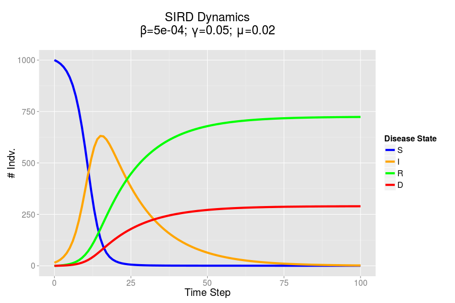
In my last post I presented the formulas which I will use to mathematically model SIRD epidemic dynamics. I also presented some preliminary R and Python code which could be used to simulate these equations over time and plot the results.

Overall I thought that this was a neat exercise, but was altogether a bit boring for you, my readers. I wanted to get you involved, and allow you to play around with the parameters being entered into these equations. I’ve also been really interested in the development of interactive graphics for displaying data of late: I think that it’s one thing for a statistician to tell a reader what they should think about a dataset, and another for the reader to actually examine the data, and draw their own conclusions. This is valuable because, in reality, it’s very easy for a savvy statistician to manipulate a graphic to tell the story that they want to tell; allowing the user to examine the data in depth, and play with the axis can mitigate this issue to some extent.

Interactive Plotting Technologies

I’ve been doing some research into interactive technologies for plotting (particularly Bokehpure d3.js, and mpld3). I actually won’t be using any of these technologies in this post, but I hope to use them sometime in the near future. Instead, I’ve fallen back on an old friend, Shiny, which I have used in the past to create interactive analysis platforms. In particular, I’ve used Shiny for an organization where I served as Director of Research. Our volunteers would fill out a reflection at the end of each of their shifts; this data was then organized and presented to shift-leaders using a dashboard I designed and developed in Shiny, which would automatically pull the latest data. This technology allowed shift-leaders to track their shift’s progress and efficacy, and was also used to guide our quality improvement (QI) initiative.

For those who are not familiar with Shiny, it is a platform built on top of the R programming language, which allows for the generation of user interfaces (displayed in the web browser). These interfaces interact with a server-side R script which receives parameter updates and produces outputs (tables, plots, etc.) which are then sent back to the user. Notably, unlike some of the technologies I mentioned in the last paragraph, Shiny requires a back-end (a Shiny server); this allows for the creation and updating of information on the client-side. If this explanation is not particularly clear to you, perhaps this project will serve as a good example of what Shiny can do.

My Shiny New SIRD Model

I based the server-side of my Shiny script on the R code I discussed in my last post, though I have cleaned the code up considerably. You can find all the code for the Shiny app in this respository, and you can try out a hosted version of this app here. The hosting for this app is provided courtesy of shinyapps.io and the RStudio/Shiny team. You can also run this app on your own version of R (assuming you have the Shiny library installed) using the command runGitHub(“shinySIRD”, “jpoles1”).

Shiny Model

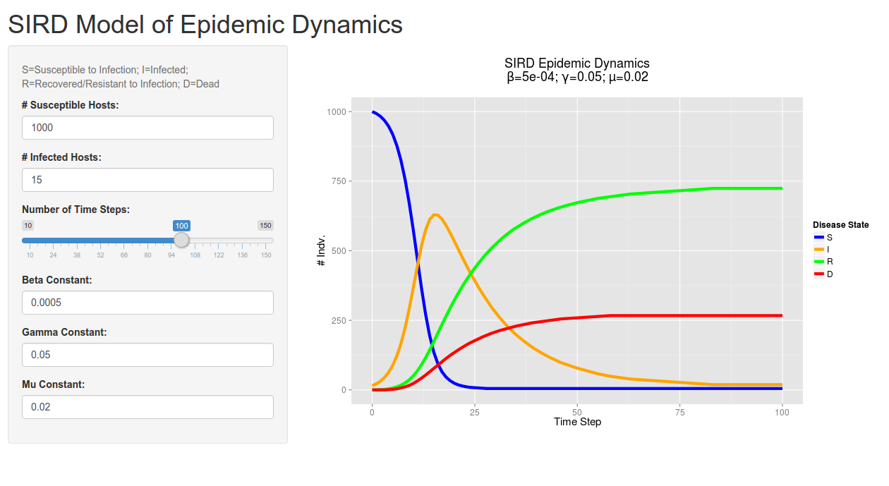
A screenshot of the client-side/user interface created by Shiny. Give it a try!

I noticed that there was actually a flaw in my original R model (when playing around in Shiny), which allowed for the infected count to overshoot the total population size when using certain values for beta. I have fixed this issue in this new code: I never allow the number of infected individuals in a give step exceed the number of susceptibles (using the min function).

Anyway, hope you have fun playing around with the Shiny app. Feel free to leave a comment if you find any errors in your tinkering (it’s certainly possible I’ve missed something), thanks for reading!

Modeling Epidemics – Mathematical Models in R and Python

In a previous post I spoke about two major approaches to modeling epidemics: the mathematical model and the agent based model. Here I detail the development of a mathematical model using two languages: R and Python. I hope to use these model in order to provide a point of comparison for the dynamics of the ABM model which I will be building.

First Steps

I did a lot of reading and research before getting started on this project. Though I had a conception of how to approach the problem of designing a simulation, I had little practical experience or insight. I began by implementing a standard SIR model in R quite a while back. I have upgraded this model and written a similar mode in Python.

In both my mathematical and ABM models, I utilize a SIRD (Susceptible; Infected; Recovered; Dead) compartmentalized type model, which is a simple representation of disease progression with discrete states. When approaching modeling mathematically, we utilize a set of equations to describe bulk population dynamics:

Equation for # susceptible individuals
Equation for # infected individuals
Equation for # recovered individuals
Equation for # dead individuals

where β = infection rate; γ = recovery rate; and μ = death rate.

Model Output – ggplot

Both of the programs which I have developed in order to recreate mathematical models are rather similar, and produce seemingly identical results when given the same starting parameters. In both cases I utilized ggplot to produce static charts. Here’s the cleaned up plot that I produced in R. I’ve included the code used to produce this output below. I hope to develop an interactive version of this simulation at some point in the future.

R Model

The SIRD dynamics of a model outbreak. In this case, I was attempting to model the outbreak of a fairly virulent pathogen (like a novel influenza epidemic). We can see that the outbreak peaks and resolves fairly quickly, albeit with a rather high mortality rate.

R Code – Updated 12/30/15

require(reshape2)
require(ggplot2)
#SIRD Model of Disease Transmission
S=1000
I=15
R=0
D=0
beta=.0005
gamma=.05
mu=.02
nreps=100
#Create History Dataframe
history = data.frame(time=0, S=S,I=I,R=R,D=D);
#Loop over step function
for(time in 1:nreps){
  newInf = pmin(S, floor(beta*I*S))
  newRec = pmin(I, floor(gamma*I))
  S = S - newInf
  I = I + newInf - newRec
  R = R + newRec
  newDead = pmin(I, floor(mu*I))
  I = I- newDead
  D = D + newDead
  history = rbind(history, data.frame(time, S, I, R, D))
}
#And finally plot
plotdat = melt(history, id.vars = c("time"))
ggplot(data=plotdat)+
  aes(x=time, y=value, color=variable)+
  geom_line(size=2)+
  theme_set(theme_gray(base_size = 15))+
  xlab("Time Step")+ylab("# Indv.")+
  ggtitle(paste("SIRD Epidemic Dynamics\nβ=",beta,"; γ=",gamma,"; μ=",mu,"\n", sep=""))+
  scale_color_manual(name="Disease State", values=c("blue", "orange", "green", "red"))

Python Code

#Loading Libs
import matplotlib.pyplot as plt
import pandas as pd
from math import floor
from ggplot import *
#Initializing Vars
S = 1000
I = 15
R = 0
D = 0
steps = 50
#Disease Parameters
beta = .0005
gamma = .05
mu = .02
history = pd.DataFrame({"S": S, "I": I, "R": R, "D": D}, index=[0])
#Run sim loop
history["step"] = history.index
plotData = pd.melt(history, id_vars=["step"])
ggplot(plotData, aes(x="step", y="value", color="variable"))+geom_line()
for step in range(1, steps):
    newInf = floor(min(max(beta*I*S, 0), S))
    newRec = floor(min(max(gamma*I, 0), I))
    newDead = floor(min(max(mu*I, 0), I-newRec))
    S = S - newInf
    I = I + newInf - newRec - newDead
    R = R + newRec
    D = D + newDead
    history = history.append(pd.DataFrame({"S": S, "I": I, "R": R, "D": D}, index=[step]))
history["step"] = history.index
#Plot using Python port of ggplot
plotData = pd.melt(history, id_vars=["step"], value_vars=["S","I","R","D"])
ggplot(plotData, aes(x="step", y="value", color="variable"))+geom_line()+xlab("Time Step")+ylab("# Hosts")