See the latest updates to this project in part 2!
With the outbreak of COVID-19 in NYC, our healthcare system has demonstrated that it is poorly equipped to respond to the needs of its clinicians and other frontline healthcare workers. Most obvious is the lack of effective personal protective equipment (PPE; namely N95 respirators and other masks) which our doctors, nurses, respiratory therapists, and others need in order to protect themselves against infection with the virus. It’s glaringly obvious that if you fail to protect your healthcare workers from falling ill, your system is going to fail — and fast too. Nonetheless, we are barely at the outset of the outbreak and our hospitals are already strictly rationing PPE, causing deeply concerning comprimises in patient and provider safety.
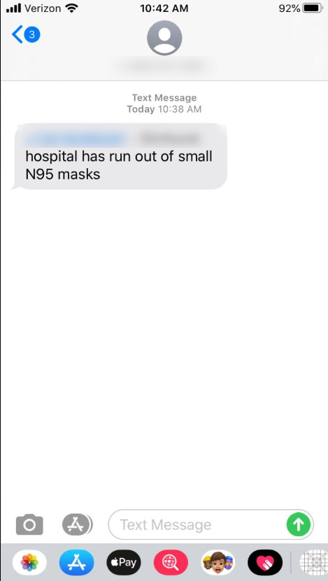
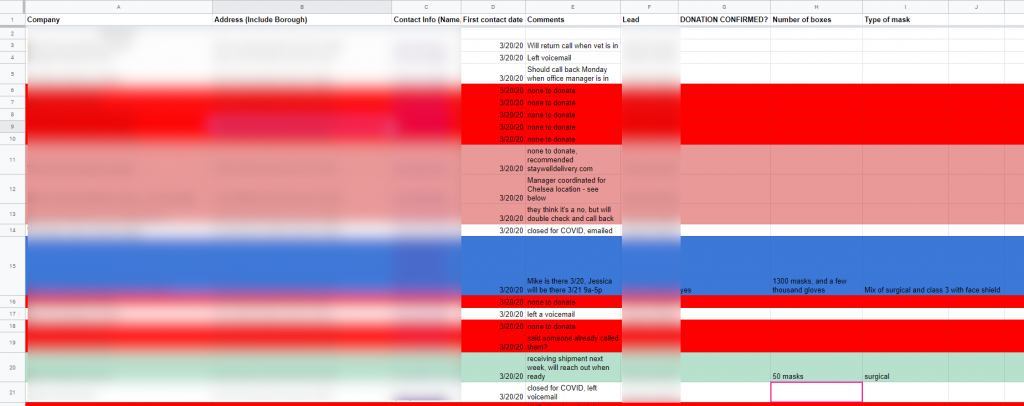
The problem has gotten so bad that residents and medical students have begun scouring the community for businesses (closing down by law) with extra respirators that they are willing to donate. I was brought on to a medical student team that was calling construction businesses, nail salons, dry cleaners, hardware stores, and tattoo parlors. The volunteers had been manually entering businesses into a massive spreadsheet: organizing the info on what business had been or needed to be called, who had donations to give, and more.
I was asked to write some code to scrape the web for a list of businesses and their contact info. I went to the Yelp API, and got to work. What resulted was a simple python notebook that I am now hoping to share with voluteers at other hospitals or med schools. The code simply takes a Yelp API key, location, and search terms and generates a CSV spreadsheet of the first 1000 businesses to match the search along with their phone numbers, addresses, and Yelp pages.
You can get started using this simple data scraper by opening the Python notebook below for free using Google Colab (look for button at the top of the code). Once open, simply change the settings for your location, search terms, and API key and you can start generating your own lists of businesses to call for donations! Our group has had success with copy/pasting each industry into its own page in a Google spreadsheet. With this system, multiple volunteers can collaborate and work on calling businesses in parallel.